
Sean Cornely, Staff
Cover photo courtesy of MLB
In 2022, Nike shocked the world by taking over Majestic as the sole distributor of Major League Baseball jerseys. A year later, they introduced a new and creative concept that has driven a rift between baseball purists and new fans: The City Connect Series. Each year, a few MLB teams slowly roll out a new uniform set that has to do with the team’s city history. Many of these designs are bold and quirky, angering the old fans, but exciting the young ones. Below I have ranked each uniform, from worst to best and have given reasons why.
16. The San Francisco Giants

Courtesy of alamy
Starting in dead last are these hideous uniforms. The Giants design team has committed the cardinal sin of sports uniform design: They used a gradient. In addition to adding a cheap looking gradient to their main logo, which makes it hard to read, they also decided to brighten up the orange color in the jersey, resembling that of a highlighter. While I do like the Golden Gate Bridge on the sleeves, it can never take mind off the horrific gradient. The Giants missed the mark on this one.
Ranking: 3.5/10
15. The San Diego Padres
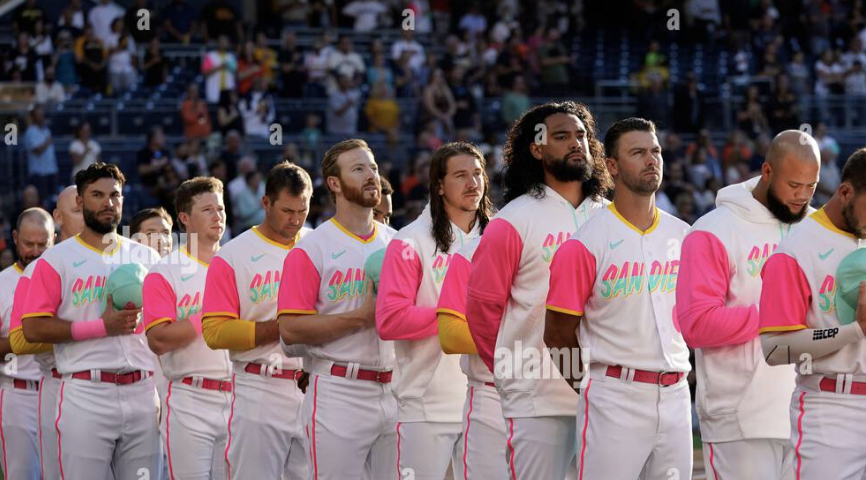
Courtesy of alamy
ESPN has this jersey ranked in their top five, probably because the Padres design team had the absolute correct idea behind a story for these. They wanted to tap into the Latin culture of San Diego by providing a jersey with pops of bright color everywhere. But that is also the reason for this being ranked last. I think they missed the mark with the way the jersey is presented though. The font is great, but having a mint and pink split color scheme across the word mark makes it hard to read and reminds me of children’s cereal that has mint and berry in it.
Ranking: 4.5/10
14. The Los Angeles Dodgers
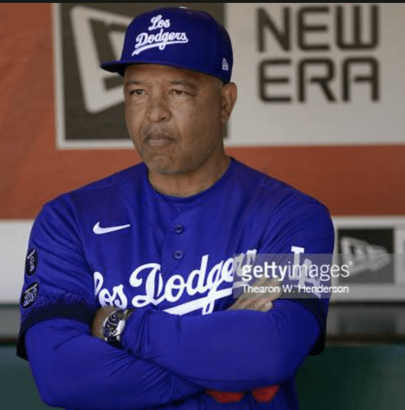
Courtesy of Gettyimages
Yet another California team resides at the bottom of the rankings with these City Connect designs. While I once again enjoy the story behind these jerseys, it’s as if no effort was made with these at all. These uniforms are quite literally their normal jerseys with “Los” slapped in front of Dodgers with the colors swapped. At least the Padres took a bit of risk. However, these aren’t hideous looking.
Ranking: 4.8/10
13. The Boston Red Sox

Courtesy of Gettyimages
Sporting News and I agree wholeheartedly on this ranking. A design revolving around the Boston Marathon is an incredibly cool idea, however, I think these fall short as a Red Sox jersey. While they have a sweet replication of the marathon’s finish line, there is no red to be found anywhere on this jersey. This has a great design, but a Red Sox jersey with no red simply cannot be a Red Sox jersey.
Ranking: 5/10
12. The Houston Astros
While I love a good cohesive jersey where the top and bottom are the same color, the Astros did not execute it well at all with navy. These jerseys remind me of my high school softball team’s jerseys and not “two-time” MLB champion jerseys. The numbers on the pants are a bad look, but I love the NASA font and “Space City” is a cool and mysterious name. Perhaps if they wore white pants with these, I’d like them a lot more.
Ranking: 5.2/10
11. The Chicago Cubs
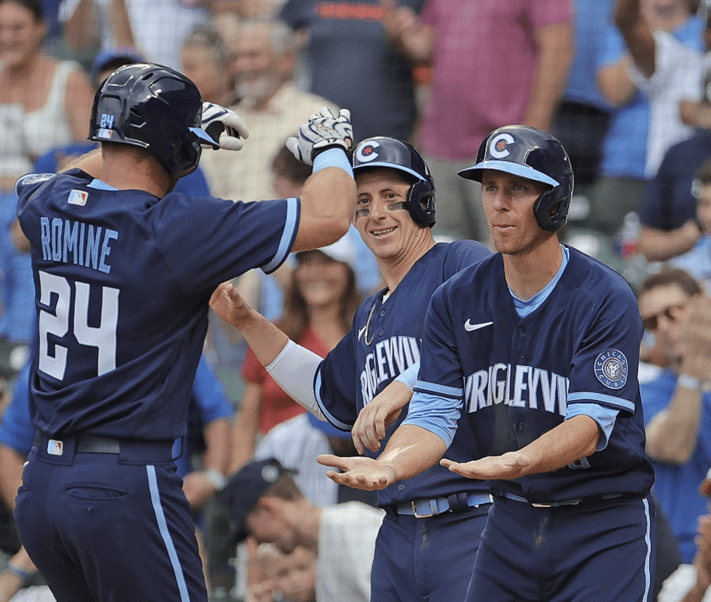
Courtesy of the MLB
Once again, the full navy uniform is an odd look. However, they stuck with their typical branding and didn’t take a whole lot of risks. I’m always a sucker for a powder blue and navy combo, though. Solid jersey, just a bit boring.
Ranking: 5.5/10
10. The Atlanta Braves

Courtesy of Gettyimages
No risks were taken here, but that’s okay. These are replicas of their timeless jerseys from the Hank Aaron era. “The A” patch on the chest is clean and not too busy, and the number on the front is nice. Good jersey, but nothing we haven’t seen before
Ranking: 6/10
9. The Texas Rangers
The most recent City Connect release has had fans up in arms. The rangers debuted these with people almost instantaneously calling them “trash.” But I think they look cool. While I’m not entirely sure about the story behind them, I think they did something different with the two tone look. The font on the front is cool and they have a very “old-timey” feel to them.
Ranking: 6.5/10
8. The Milwaukee Brewers
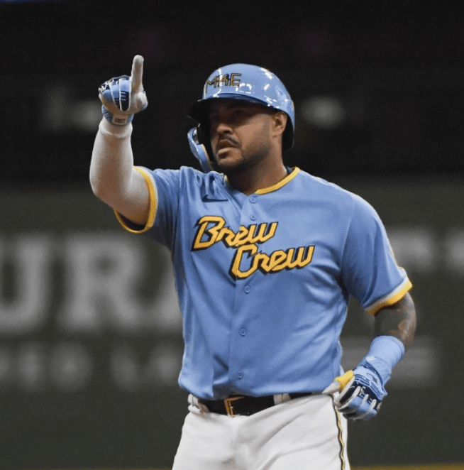
Courtesy of the MLB
The Brewers design team did a fantastic job with these jerseys. Powder blue, navy and gold is going to hit the mark ten times out of ten. I only have one slight problem with them that brings the entire design down, and that’s the “Brew Crew” saying on the front. It feels cheap and like something that I’d see on an MLB The Show game. If there was any other wordmark on the front, these would have top 3 potential.
Ranking: 7.2/10
7 and 6 TIED. The Arizona Diamondbacks and the Los Angeles Angels

Courtesy of Gettyimages
A California team is finally featured in a good light on this list! The Diamondbacks and Angels jerseys are tied because I find them to be very similar. Both sandy colored jerseys pay homage to the sand in the state (beach and desert). Both contain numbers on the front left of the jersey. Both are overall really clean-cut and sharp jerseys. I love the different fonts they both used and I think these are absolute wins.
Ranking: 7.8/10
5. The Colorado Rockies

Courtesy of the MLB
Now that I have reached the top five, I want to put a disclaimer: Any jersey that is below another, I do not find to be “worse” than, it just so happens that I think the other is better. The Rockies did an incredible job here. Their uniforms are paying tribute to the state’s incredible license plate and they translate so well to jerseys. The deep green is a sleek color and everything about it is amazing. I would like to potentially see some purple in the mix, or white pants instead of the green, but other than that, these are perfect.
Ranking: 8.2/10
4. The Miami Marlins

Courtesy of the MLB
With that being said, I love these Marlins jerseys. Paying respects to their former minor league team “The Sugar Kings” is a great idea. The orange pops against the blue and white and it just screams “Miami Marlins.” Everything here is amazing.
Ranking: 8.5/10
3. The Kansas City Royals

Courtesy of the MLB
Not many people were excited by these uniforms when they were released, but I’ve loved them forever. The Navy with the light blue is gorgeous, the “KC” in the style of the many fountains within the city, and the large arm bands that are a nod to former Royals jerseys make these one of the best in baseball. Amazing.
Ranking: 8.9/ 10
2. The Washington Nationals
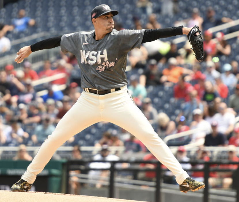
Courtesy of the MLB
After seeing the horrific attempt that their NBA counterparts made, I was terrified when I heard that the Nationals were going to be making a cherry blossom jersey. However, when I first laid my eyes on these, I was left speechless. The textured gray is perfect, the cherry blossoms on the hat and the chest don’t come across as cheap, and the large “WSH” font is amazing. These are incredible fashion forward and I can see people wearing these in public at any time. Washington, despite being an awful baseball club at the moment, at least looks good.
Ranking: 9.3/10
1. The Chicago White Sox
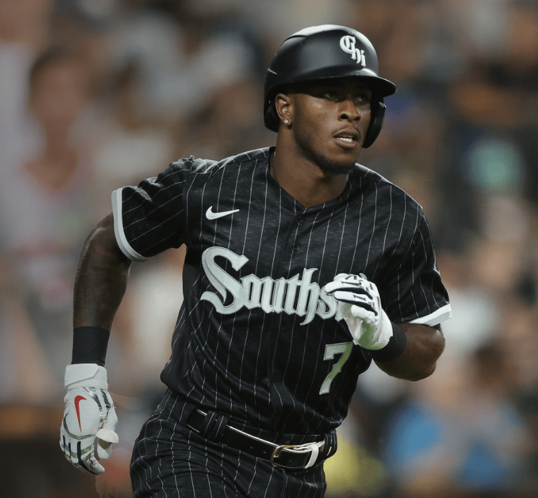
Courtesy of the MLB
Perfection. Absolute perfection. From the full black jersey, to the white pinstripes, to the “Southside” on the front, there isn’t a single flaw in this jersey. There will always be the classic Yankees pinstripes, and the Phillies powder blues, but these jerseys may be one of the best of ALL TIME. They’re intimidating, cool, fashion forward and look amazing on the field. These are the best City Connect jerseys we have gotten so far. It’s just a shame that this was the third jersey to be released, because Nike will never top this one.
Ranking: 11/10 Nike has a long way to go with these uniforms. I ranked half of these uniforms below a 7, meaning there’s a lot of D tier and F tier jerseys out there. They have 4 more to debut this year alone and then 10 more to go with some iconic teams. My only note for Nike is to not mess with tradition when it comes to the Yankees, Mets and Phillies because they will anger a lot of fans.

